Objectives
The objectives of this section are:
to introduce the basic concepts in data visualizationto explain the various visualization techniques
to understand in which situation a particular technique is used
to introduce higher dimensional visualization techniques that exist
Outcomes
By the time you have completed this section you will be able to:
choose a visualization technique based on the dataset attribute
create a scatter plot, histogram and stem and leaf plot
list common visualization techniques
Pie Charts
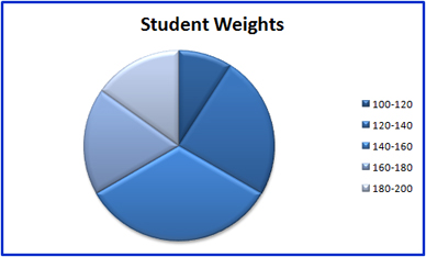
Are similar to histogram but they are normally used with categorical attributes with a small number of values as opposed to continuous attributes. The key difference is that pie charts aims to show frequency by the use of area as oppose to height as used in histograms. Figure 2 is the corresponding pie chart for the histogram example used in the novice level.
Scatter Plots
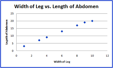
A Scatter plot is used to demonstrate linear correlation. It is a type of display which uses the x and y coordinates to illustrate the value of two variables for a set of data. Figure 3 is an pictorial representation of the relationship between the width of spider's abdomen and its leg length.


